Have you ever walked into a room and felt something was just… off? You’re not alone. Research shows that 87% of homeowners struggle to match their furniture with their room’s colour scheme.
Most of us know the feeling – that moment of staring at our living space and wondering why a perfectly good sofa looks out of place. Sometimes a beautiful accent chair doesn’t quite work with our colour palette interior design. This becomes frustrating when you’ve already invested time and money in quality pieces.
Here’s the good news – making your furniture go together with your house’s interior colours isn’t rocket science. Our team has helped countless homeowners change their spaces from mismatched to beautifully coordinated, thanks to our expertise in modern interior design.
Let’s take a closer look at our proven step-by-step process to create a cohesive look that makes your furniture shine in this piece. Your space can become a perfectly matched haven, and we’ll show you how!
Understanding Your Existing Space
Let’s examine your existing space before we jump into colour choices and new purchases. A successful interior design starts with a good understanding of what you already have.
Analyzing Current Furniture Pieces
Start with a full inventory of your existing furniture. Here’s our tested process:
- Document each significant piece
- Assess the condition and style
- Note the dominant materials and finishes
- Think about which pieces you want to keep
- Identify items that need updating
Identifying Dominant Colours
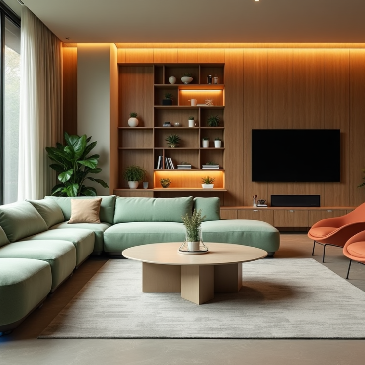
Modern interior design follows the 60-30-10 rule for colour distribution. Your dominant colour should cover about 60% of your space, including walls, floors, and large furniture pieces. Your secondary colour should appear in furniture and larger decorative elements, taking up roughly 30% of the room. The accent colour works best for accessories and wall decorations, filling the remaining 10%.
Assessing Natural Light Effect
Natural light plays a significant part in your colour palette interior design. South-facing rooms receive cooler, bluish light, and north-facing rooms make dark colours appear brighter. East-facing spaces get warm morning light that turns bluish as the day progresses.
Light colours help spaces feel larger when selecting house interior colours. Dark shades can create intimate atmospheres in smaller rooms with proper lighting balance.
Room direction affects colour perception a lot. To name just one example, see west-facing rooms that benefit from evening sunlight casting warm, intense shadows. Vibrant colours should be avoided in these spaces since harsh lighting can make them look dull. Pale and subdued tones work better as they warm up naturally throughout the day.
Note that your furniture pieces might look different as natural light changes during the day. Light-coloured walls can reflect bold tones from your furniture – a deep red rug might cast a subtle reddish tint on white walls. This knowledge helps create a cohesive house interior design that looks beautiful around the clock.
Creating Your Colour Strategy
Let’s create a strategic colour plan that will revolutionize your interior into a cohesive masterpiece. You’ll learn to develop a colour strategy that looks professional and feels uniquely yours.
Choosing Base, Secondary and Accent Colours
Modern interior design starts with your base colour selection. This colour will be the foundation of your colour palette interior design. Your dominant colour should cover about 60% of your space through walls, large furniture pieces, and flooring. A neutral or softer hue works best to set a calming tone.
Your secondary colour should take up roughly 30% of the space. Pick a shade that’s bolder than your base colour but still complementary. This colour will show up in medium-sized elements like curtains and accent furniture.
Here’s a proven process to select colours:
- Choose a neutral base colour for walls and large furniture
- Select a complementary secondary colour for medium elements
- Pick a bold accent colour for small decorative pieces
- Test all colours under different lighting conditions
- Verify the colours work with existing architectural features
Using the 60-30-10 Rule for Furniture
The 60-30-10 rule applied to furniture will give you the most balanced house interior design. Your largest furniture pieces should be arranged with your 60% dominant colour. This creates a grounded and cohesive space rather than a chaotic one.
Your secondary 30% colour shines through accent furniture and upholstery choices. Dining chairs, side tables, or a statement armchair work well here. The final 10% comes alive in your smallest furniture pieces and accessories where bold colour choices make sense.
Incorporating Existing Colour Elements
Successful integration of existing elements is a vital part of house interior colours. It’s worth mentioning that your current flooring, built-in cabinetry, and architectural details should guide your colour strategy. These permanent features influence your colour choices to create a harmonious flow throughout your space.
The 60-30-10 rule serves as a guideline that adapts to different styles and priorities while keeping a harmonious look. This approach helps create unique spaces that showcase your personality while following proven interior decorator principles.
Selecting Complementary Furniture
The secret to a successful colour palette in interior design lies in the details. Let’s explore ways to create perfect harmony between different materials and finishes in your house’s interior design.
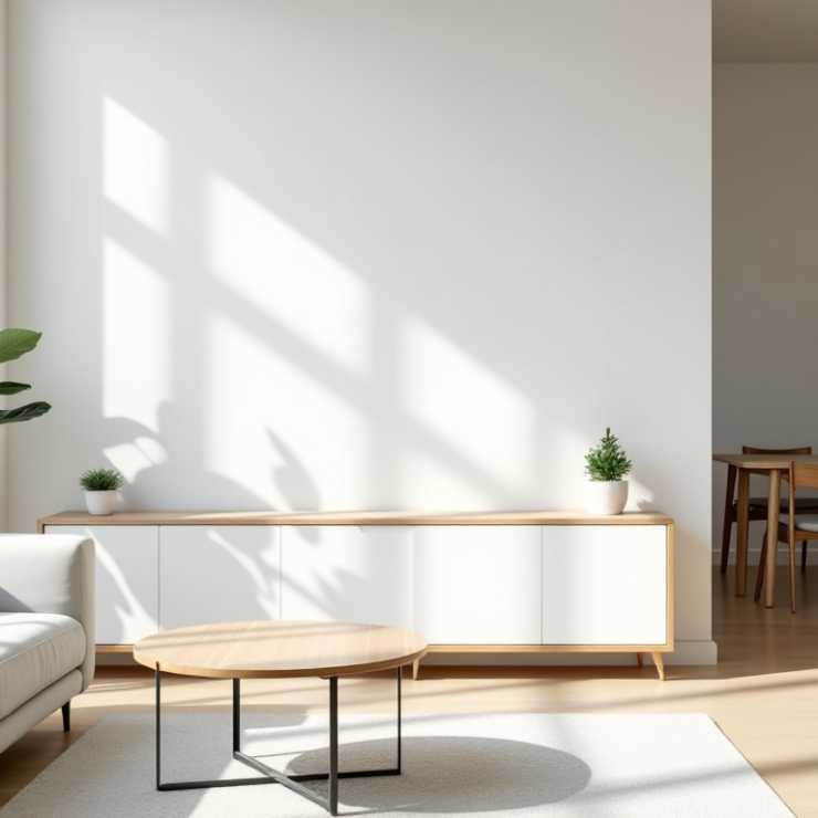
Matching Wood Tones and Finishes
Our experience as interior decorators shows that mixing wood tones successfully depends on understanding undertones. You should limit wood variations to all but one of these tones distributed evenly throughout a space. Here’s our tested approach:
- Identify your dominant wood tone (usually flooring)
- Choose contrasting pieces intentionally
- Match undertones between different pieces
- Repeat each tone at least twice in the room
- Balance light and dark finishes
Note that using woods with similar but not exactly matching tones can lead to design mistakes. Strong contrasts work better when combining different pieces.
Coordinating Upholstery Colors
Mixing and matching fabrics creates a captivating ‘lived-in customized look’ without appearing too coordinated. Exact colour matches between different seating pieces aren’t necessary. The modern interior design looks better with dark colours paired with light hues or vibrant shades matched with neutral tones.
Balancing Metal and Glass Elements
A cohesive look requires limiting metal finishes to 2 or at most 3 types. Glass and metal elements work best with these principles:
Glass adds spaciousness and welcomes natural light, which reduces artificial lighting needs. Metal finishes should spread around the room, just like accent colours. Pro tip: Black iron or nearly black bronze acts as a neutral and combines well with almost any other finish.
Modern interior design shines with wood’s natural warmth combined with metal’s contemporary edge and glass’s luminosity. This material mix creates spaces with identity and depth, striking a balance between strength and comfort, brilliance and softness.
The finish of each material plays a crucial role. Polished surfaces add glamour and luxury. Matte finishes create a more understated, modern look. Each material should serve its purpose while contributing to your space’s overall aesthetic harmony.
Strategic Furniture Placement
Strategic furniture placement serves as the life-blood of bringing our colour palette interior design to life. Our experience as interior decorators shows that thoughtful positioning can transform a disjointed space into a harmonious home.
Creating Colour Flow Between Rooms
House interior design requires more than matching paint swatches to connect spaces through colour. Different textures with similar colours establish a layered look that creates a natural flow. Your home needs pops of colour from adjacent areas to achieve uninterrupted transition.
Our proven steps create a cohesive flow:
- Start with one dominant colour and use its opposite hue in smaller, judicious pops
- Create relief through circulation spaces
- Use flecks and accents as connecting elements
- Think over ceiling colours as part of your palette
- Incorporate metallic elements for visual connection
Using Colour to Define Zones
Colour has become a powerful tool for zoning spaces in modern interior design. Open floor plans benefit from contrasting colours that define distinct activity areas. Bright pink and vivid yellow can create separate living and dining zones while unity emerges through neutral elements.
Specific zones wrapped in full colour – including walls, ceiling, and even floors – create a true element of surprise and definition. Open-plan spaces without physical barriers showcase this technique’s effectiveness.
Balancing Light and Dark Pieces
Perfect balance between light and dark furniture demands strategic positioning. House interior colours achieve harmony when both dark and light wood pieces are distributed evenly throughout the space. This approach creates visual weight that anchors the room without disrupting the flow.
Dark furniture placement works best when you:
- Place pieces near windows or under skylights to maximize natural light
- Use light-coloured rugs to create contrast and define spaces
- Add adequate ambient and task lighting to brighten the space appropriately
The tension between opposing elements adds vibrancy and excitement to your home. Light and dark pieces create a contrast that generates movement and interest while maintaining a sophisticated balance in your interior decorator scheme.
Adding Finishing Touches
The finishing touches in your colour palette interior design work like perfect accessories to a great outfit – they bring everything together. These final elements can change a good room into an extraordinary space.
Selecting Accent Pillows and Throws
Pillows and throws offer the quickest way to refresh your space. Our years of interior decorating experience suggests this proven arrangement:
- Choose a colour story that pulls from your existing palette
- Mix different patterns while maintaining your chosen colours
- Vary textures to create visual interest
- Balance sizes between large and small pieces
- Layer throws strategically to add depth
Your pillow combinations should stay cohesive by including at least one colour from your room’s existing palette in each piece. The accent colours should spread evenly throughout the space for the best visual impact.
Incorporating Art and Decor
Art pieces breathe life and soul into your house’s interior design. Here’s what we suggest when picking artwork:
- Choose pieces that align with your furniture’s scale
- Pull out one or two bold colours from your room for artwork selection
- Think about learning art pieces to create a relaxed, modern feel
- Layer different mediums to add interest
Modern interior design doesn’t require artwork to match perfectly – it just needs to go together with your space. Artwork can inspire an interior colour scheme and lets you highlight specific tones through cushions and other soft furnishings.
Using Rugs to Tie Colours Together
Rugs serve as vital unifying elements in house interior colour schemes. A well-chosen rug can instantly change the look and feel of your space. These key factors matter when selecting a rug:
A vibrant rug against neutral tones brings light to the room and adds colour. Spaces with bold furniture need rugs with subtle tones to create a balanced focal point. Your rug should complement both furniture pieces and wall colours while adding that perfect finishing touch to your interior decorator’s vision.
Pro tip: Lay out potential rug patterns on the floor first to ensure all shapes and colours work together. This simple step helps avoid getting pricey mistakes and ensures your final selection ties your room together perfectly.
Conclusion
A well-coordinated colour palette and furniture selection can elevate an ordinary room into a masterpiece of design. The right colour coordination creates sophisticated yet welcoming spaces, from the initial space analysis to the final decorative elements.
You’ll achieve better results with furniture and colour coordination when you apply proven principles like the 60-30-10 rule while expressing your unique style. The goal isn’t to match everything perfectly – it’s about creating meaningful connections between colours, materials, and finishes throughout your space.
Your room’s natural light and existing elements should guide your colour strategy and furniture selections. The right placement and carefully chosen finishing touches will help you realise your vision effectively.
Take time to play with different combinations until you discover the perfect balance that makes your space feel like home. Simple changes in furniture arrangement, accent pieces, or colour distribution can dramatically improve the harmonious look you want to achieve.
FAQs
Q1. How do I choose the right colour palette for my room? Start by analyzing your existing space, including furniture and natural light. Choose a base colour for 60% of the room, a secondary colour for 30%, and an accent colour for 10%. Consider the room’s purpose and the mood you want to create when selecting colours.
Q2. Can I mix different wood tones in my furniture? Yes, you can mix wood tones, but limit variations to no more than three tones distributed evenly throughout the space. Identify your dominant wood tone, choose contrasting pieces intentionally, and match undertones between different pieces for a cohesive look.
Q3. How can I create a colour flow between different rooms? Use similar colours in varying textures to establish a layered look. Incorporate pops of colour seen in adjacent areas throughout your home. Consider using a dominant colour with its opposite hue in smaller, judicious pops, and use flecks and accents as connecting elements between spaces.
Q4. What’s the best way to use rugs to tie colours together in a room? Choose a rug that complements both your furniture pieces and wall colours. For spaces with bold furniture, opt for a rug with subtle tones to create a balanced focal point. In rooms with neutral tones, a vibrant rug can bring light and add colour. Always lay out potential rug patterns on the floor first to ensure all shapes and colours work harmoniously together.
Q5. How can I use colour to define zones in an open floor plan? Use contrasting colours to define distinct areas for different activities in open floor plans. Consider wrapping specific zones in full colour – including walls, ceiling, and even floors – to create true elements of surprise and definition. Balance this with neutral elements to maintain unity throughout the space.
Related Posts